Why We Built Magazine Captions
A user's suggestion led us to magazine-style captions: clearer visual emphasis, room for the speaker, and less manual design work—with help from AI.
Matt
Founder of CaptionBolt
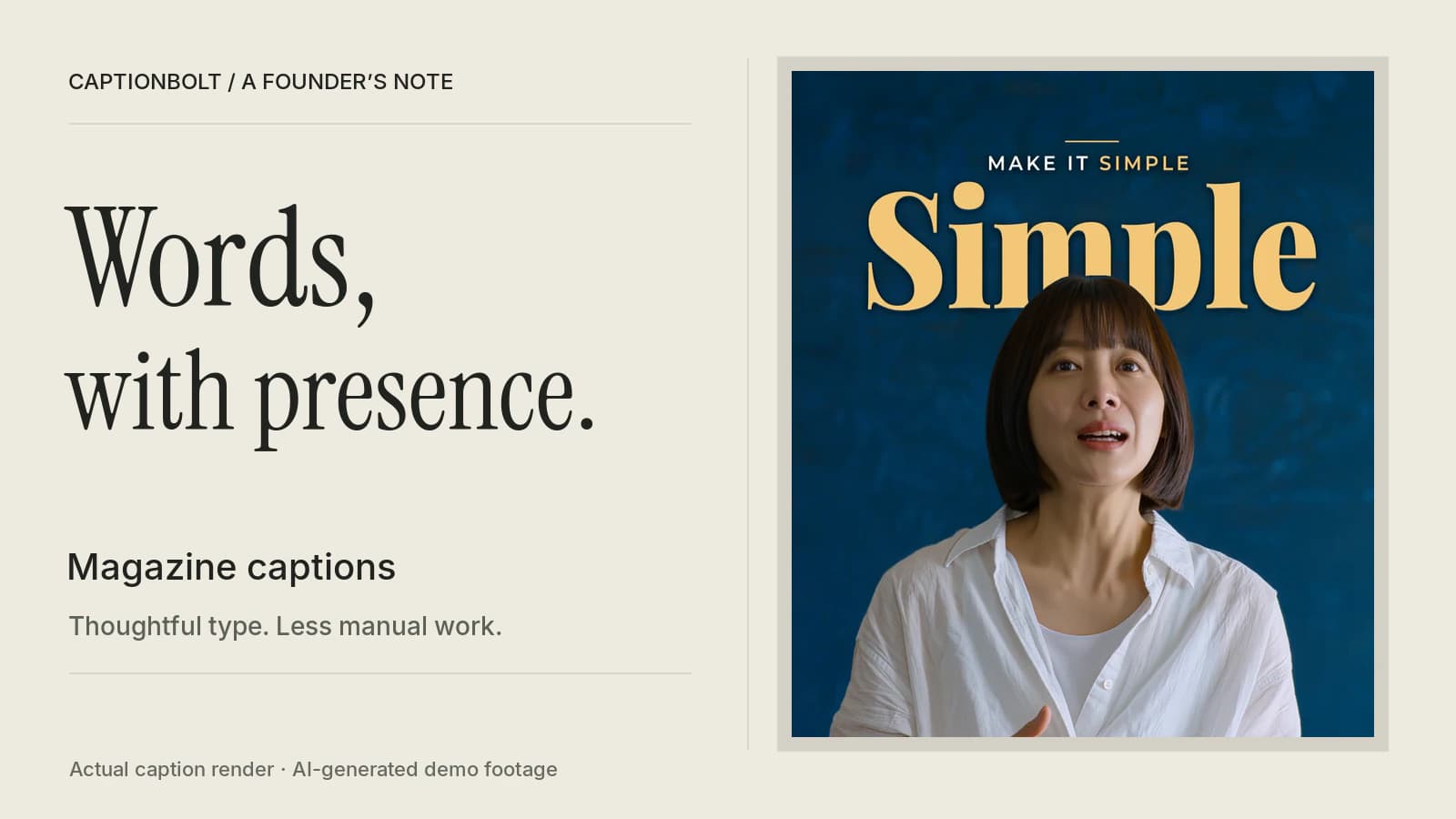
Magazine captions began with a suggestion from an enthusiastic CaptionBolt user. I'm grateful for it. Their feedback gave us a concrete direction to explore: bringing the typography and composition of a magazine page into a talking video.
That idea fits something I care about as CaptionBolt's founder. People arrive with something worth saying and a video they have already recorded. I want them to have good ways to present it, even if they have never designed a layout or animated a line of text.
Magazine is our attempt to make that easier. It brings together designed caption styles, AI planning, and layout that responds to the picture. You choose a starting point, review what it does with your words, and adjust the result.
Giving a Sentence a Visual Center
Think about a simple sentence: “Make it simple.”
You can show those words one at a time, following the voice. You can also hold the phrase together and give “simple” more space. The words carry the same message, but the second treatment gives the eye a clear place to land.
That is what interests me about magazine typography. Size, spacing, contrast, and empty space help organize an idea. A headline gives you an entry point. Smaller text provides context. The photograph still has room to matter.
In a video, that creates another way to support the speaker. A phrase can stay together long enough to read as a thought. A main word can make the emphasis visible. The placement can leave room for a facial expression instead of covering it.
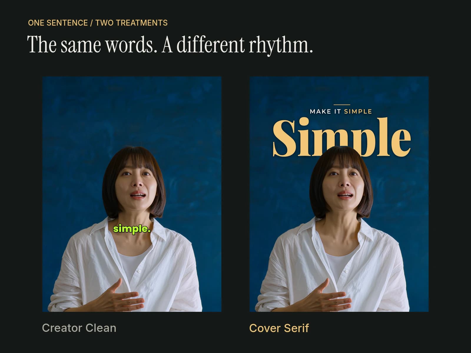
Different videos benefit from different treatments. A quick, energetic explanation may suit word-by-word captions. An interview, lesson, or reflective thought may benefit from a quieter phrase or a more deliberate composition. Magazine gives you another way to match the captions to the feeling of the recording.
The Manual Work Behind That Look
Building this kind of sequence by hand in a traditional editing workflow involves a series of decisions. Where should each phrase break? Which word deserves emphasis? How large can it be while the rest stays readable? Where should the text sit as the speaker moves?
Then come the practical steps: arranging text layers, choosing complementary type, setting entrances and exits, and checking the result against the footage. A moment with text behind the speaker also needs a way to separate the person's outline from the lettering and maintain that overlap as they move.
Experienced editors can make beautiful work this way, with detailed control. For someone who has just recorded a lesson or a business update, it is a lot of additional work to learn before publishing.
That is the difficulty I wanted us to reduce. A creator should be able to try an editorial caption treatment without first learning how to construct every part of it.
Where AI Takes on the First Pass
When you first choose a Magazine style, AI reads the transcript and plans how to divide it into pages, which main words to feature, and how strongly to emphasize them. That gives the design a starting point based on what is being said. This planning does not use processing minutes.
The caption styles provide the typography and composition. Some have the presence of a magazine cover. Others use a pull quote, a compact column, or a quieter line of text. You can try different Magazine styles while keeping the page plan.
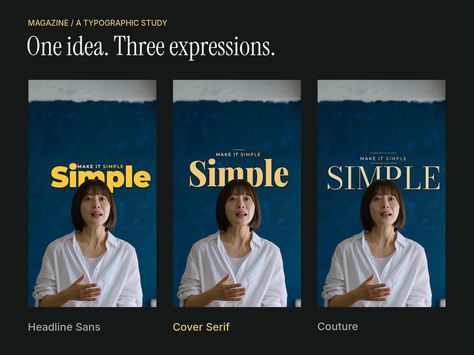
On new uploads, scene analysis also helps the layout take the picture into account. It tries to keep text clear of the speaker's face and head, and away from bright or busy areas where reading would be difficult. The aim is to give both the words and the person room on screen.
Together, those steps reduce the amount of setup you need to do. You can spend your time asking whether the emphasis feels right and whether the result fits your video, with a designed first pass already in front of you.
Leaving Room for a Strong Moment
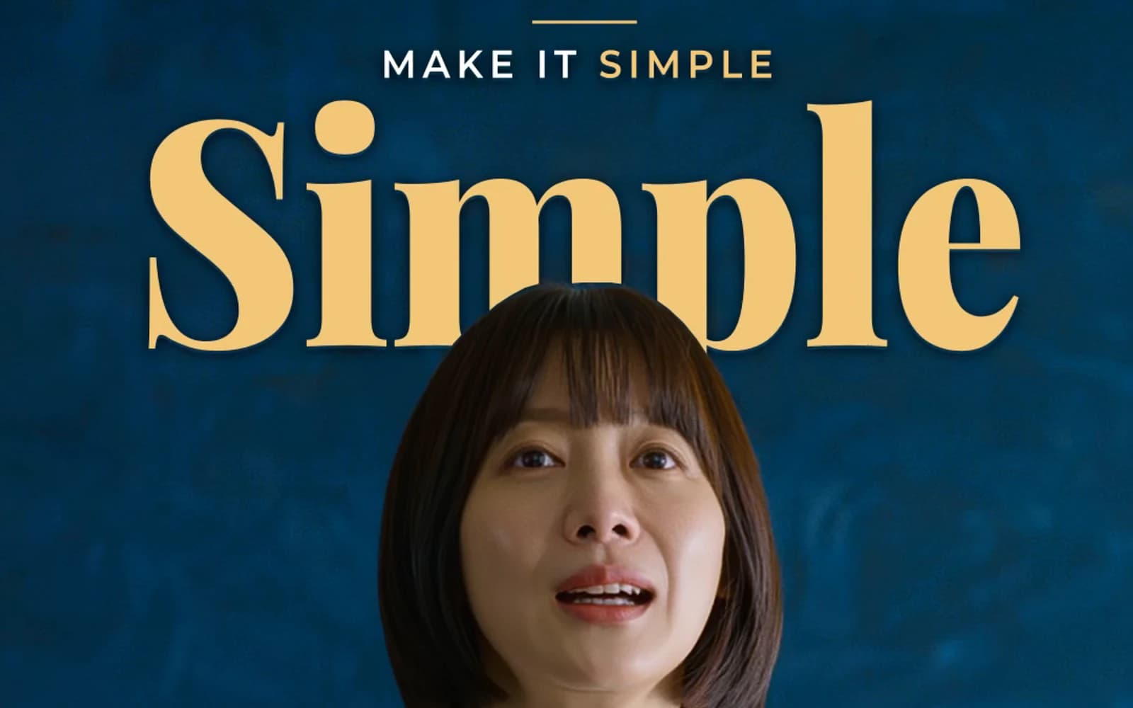
One effect I particularly like is text appearing behind the speaker's head, as a magazine title sometimes sits behind the cover portrait. It adds depth and makes the lettering feel connected to the picture.
It also needs restraint. If every sentence asks for the same amount of attention, the important ones have less room to stand out.
Styles marked Behind speaker can use this treatment occasionally, when the head outline is clear and the composition has enough room. A tight close-up or a head near the top edge may leave no suitable space. You can switch off Text behind the speaker in Customize whenever you prefer.
The same restraint applies to emphasis throughout the video. Some phrases should feel calm. Others deserve a little more weight. I want the design to support those differences.
Your Words, Your Final Decision
AI can pick a main word that misses what you meant. It can give a phrase more energy than you would. That is why the first pass needs to stay editable.
In Text Editor, you can change the Main word on each page and adjust its intensity. Customize → Edit main words takes you to the same controls. You can also adjust the style's available font, color, and position settings, or choose a different look. The page plan can be undone.
My hope is that this makes thoughtful caption design accessible to more people. You bring the recording and the meaning. CaptionBolt helps with the repeated layout work, and you decide whether the result says what you intended.
To try it, upload a video, open Captions, and choose the Magazine group. Start with a look that fits your content, check the main words, and watch the result before exporting. You can explore the workflow on our Video Captions page.
And to the user whose suggestion started this: thank you. If you try Magazine, I'd like to hear what works for your videos and what still needs attention. You can send us feedback. Real examples help us make better decisions.